Social Profile – Free Advertising

Everyone has been asking in the chats what are Social Profiles as they have been seeing them on a number of the sites and not really sure what they are or what you do with them.

Each site may rebrand them and they might go by other names depending on the site and what the owners are naming them – I will give you some examples later on – first I want to tell you that you are missing out on some great FREE advertising in all the sites that have this mod.

To get started login to one of your favorite sites and see if they have this mod. You may have to hunt around on some of the sites but what you are looking for is My Social Profile and it’s going to look something like these examples of mine

Hungry For Hits

Tezzers Social Profile

Orbital Traffic

LFM Social

The Food Game

After you have logged into the site – click on My Social Profile and if offered pick a background for your pod/blog, then you can put in your info. I am just amazed at how many I see when surfing and there is nothing but the person name and picture – nothing else has been added.

This is a great way to meet other people that you have things in common with – ONE you both are advertising on a Traffic Exchange (TE) and you both are wanting others to see what you are promoting – so I am hoping after this blog post that I start seeing lot more people filling in their Traffic Pods in their Social Profile.

AND for some of you that don’t know what to write and just want to add a banner of one of your sites that you promote which in my opinion is better than leaving things blank – here is the code that I use to add that banner to my post

<a href="https://hummingbirdhits.com/supersplash.php?rid=2509" target="_blank&quot;" rel="noopener"><img src="https://hummingbirdhits.com/getimg.php?id=8" width="400" border="0"></a>

Now get out there and lets see some post – you don’t have any excuses anymore – if you have any questions or comments – just leave them below and will answer each and every one – enjoy

P.S. Bloggers – did you see how I used this to lead you back to my blog – hint, hint

Keep Your Profile Updated

Today I have run into a few things and thought I would share with you and why you should keep your profile updated.

As a TE owner, there are times that extra prizes are given for different reasons at a site and I was working on awarding prizes today to find that alot of members profiles were not updated.

If you want to earn these extra prizes, you need to fill in your Food Game username,  your TEHQ (Traffic Exchange Headquarters)  username – you are missing out on your prizes if they are not filled in.

The other thing that I also ran across today – you know how you get emails saying that you have commissions, referrals etc.  well if you have the box unclicked in your profile you will not get these notices.

Well I knew I had gotten quite a few from sites and thought I’d go and check out where I might be at payout.  Most of you know that I use TECP (TE Command Post) to check this and wow what a surprise.

When I logged into TECP, I could see that I was at payout at quite a few sites and from there I could click on the site to login and see what was wrong.  Yes I’m guilty sometimes of forgetting to put in my payment addy and I actually was surprised when I got to some sites.

Now I’m not sure when this happened but from what I hear there is a new plugin that some sites have added and this is another reason why you should keep your profile updated.

If you have not been to your profile lately, take the time to check them as I have also been told that if this is not filled in then – you may not get your commissions.

Get Traffic To Your Blog

It’s funny how conversations in Skype rooms can give you a topic for a blog post and this one is going to surprise you on how to get traffic to your blog.
I was just in a Skype room and the conversation was that one site owner was not allowing blogs in their site.  So it was asked why as a blogger I like to get people to my blogs to help people from not going through some of the things that I have learned the hard way.

The conversation went to that the reason they didn’t was because people were just adding their main page and to me I agree that is just as bad as adding the home page or main page of a TE (traffic exchange) and wonder why you are not getting any referrals.

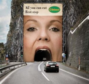
The one thing that came out of this conversation was think of advertising in TE’s as a billboard along a highway.  That ad on the billboard has to grab your attention going down the road at 65 mph.  Online advertising is no different – you members are surfing at 6, 8 and 10 second timers – you have that time frame to grab their attention.

Sourch: inboxity

Source: inboxity

HOW DO YOU DO THAT?  You have to get creative as an advertiser and put out splash pages or squeeze pages that are going to give them a REASON to click.  Just like the billboards along the highways – give the driver a reason to take the next exit and visit their store.

I recently did a blog post on What Happened to Creativity?  When is the last time you looked at ads in a magazine, newspaper, or even google ad examples?  Study those ads and notice how they are set up and that there are only key points there so that you will go to the store, go to their website, etc.

Bottom line is if you are trying to get traffic to your blog then you need to give me a reason to click and go to your blog – put on your creativity hat and can’t wait to see your ads that you create.   Below is one example of how you can get people to your blog.

Square Banners 101

After spending hours of cleaning up the Square Banners, I thought this would make a great blog post Square Banners 101.  In this post I’m going to show you how many people waste impressions and in some sites waste, piles of money as you have to buy the square banner impressions.

If you are not sure what a square banner is, it is just that… square.. and it measures 125X125 pixels. Most sites will have these for you to use in the Affiliate Toolbox. If the site does not offer this, contact the site owner and tell them what you need or just make your own.


Now many of you are trying to put a 468×60 in where the 125×125 square banner goes.  When you do this, people can’t read your banner… thus wasting impressions and money – here are some examples


Also Photobucket has changed its terms… people who were using Photobucket to store their images… can no longer use Photobucket for free 3rd party hosting. Photobucket defines 3rd party hosting as the action of embedding an image or photo onto another website.  So basically what they want you to do is pay a monthly fee now to host your images and anyone that has not paid you will see an image like this

Image result for photobucket 3rd party hosting

Now if are experiencing this – there are a few things you can do and that is sign up to the monthly upgrade at Photobucket.  The other thing is that you can go to your Photobucket account and save the images to your computer and then upload them to your own domain’s site.  A third option is to get a cheap domain and get a $2 yearly hosting package from some hosting (Maderite does this) and store all the photos there and use your own link for these banners… I suggest that people buy their name domain… twofold purpose and hang the jpgs and gifs and pngs there and if you upload the graphics to the root of the domain… it is simple…. domain.com/graphicname.jpg

One more thing that you should pay watch when designing your own banners are the colors – a dark text on dark background is very hard to read… also just using different colors won’t work for people who might be color-blind… saturation is also important…

AND I remember when I first started I thought that the flashing was eye catching until  I got a ticket from a member letting me know that every time she saw my ad – it gave her a migraine. (also can trigger epileptic seizures)

So keep in mind when you are designing… just because you CAN get fancy… most of the time you will find the K.I.S.S rule applies.

What Do You See When Surfing?

judgingcatWhile I am one that surfs many sites – today I was just thinking (scary thought
huh?) what do you see when surfing?  I bet if asked each of you would have
a different answer on what they see when surfing.

Since I am well over due for a blog post, I thought I would put it out there and see what others are really seeing.  There are many reasons that a person surfs , most surf to earn credits to get their sites seen.

This post is to try to get you to pay attention to what are you really seeing
and do you really know what you have seen.  Now if most were honest bet
the main thing that you watch are the icons and making sure you are clicking
the right ones – come on I know I’m guilty of that sometimes as my mind
wanders and stop paying attention.

But when I’m really paying attention there are things that I look at – like –
which sites are being shown and who is promoting and taking action.
Then I also pay attention to the banners and text ads to see if there is
something there to make me want to click and what was it that made me
want to click.  Plus I’m always looking for new ways and ideas to promote
Zaney Clicks and surfing wakes up my creativity.

223983781438059586_OQ73fQx9_bNow I know most of you get that page what was the last site you seen? How many of you get it right and how many of you don’t.  I know lot of people don’t like that mod but I really think that is great as it does help to wake you back up from just the click, click, click and not really paying attention

And yes I have missed those questions and why I know they do make me pay attention more  after missing one – the next time is comes up don’t it make you feel better when you get it right.  Well this not only is good that you were paying attention but then you are not viewing ads like you wish others are viewing yours.

Well it amazes me that I have no clue what I’m going to say when I start and
then all of a sudden I have see that I went on and on – oops.  But one other
thing to sum all this up – just don’t click, click, click to earn that penny, nickel,
stamp, helmet, trophy, chef hat – really pay attention to your fellow members ads.

Leave a comment and let’s hear what do you see when you are surfing – don’t
be shy as your feedback will be very helpful to others – no matter how long
you have been doing this – we still can learn new things – teach me something

comments2

Making your text ads work from lessons I learned

It’s interesting how many times I hear that text ads don’t work, I never get results from text ads and let me tell you they do work with some tweaking.  Here are some things in making your text ads work from lessons I have learned

161777811584436570_IxPBd3u7_bOver the years, I have watched text ads and headliners to solo ads and I can tell you there is a trick to all this that I discovered.  One when you are viewing ads – that text ad is competing with other things on that page and it has to jump out at you and say click me.

Now if you are viewing ads and you just see another sites name that really don’t excite me as I already know what I’m going to see when I click.  So kinda boring don’t you think????

Now what if you put some pazazz, excitement, curiosity in that text ad – you need to give the person viewing ads a reason to click that text ad. Here is a few examples …..

Cheaper than a gallon of gas
You will be tempted….
Adult Coloring Books!!!
You Afraid of ALIENS ?
There Is Life After PAYPAL
Close your eyes and make a wish
Not Surfing Here? Big Mistake!

These are just a few that I picked out to show you – the first one is surely a way to catch someone’s eye without putting in a price.  2nd one – tempted on what – click and see – so simple huh?  Adult Coloring Books – well that made me click and they are really Adult Coloring Book – awesome books – great Christmas gift.  You Afraid of Aliens?  well I had to click that one just to see who was being clever lol.

And with all the downers going on about Paypal – the next one was hope and let you know that this might have been a stumbling block but life does go on – very good one.  Close your eyes and make a wish – again clicked that one just to see what I could wish for.  AND if you have a site that is working for you – thought the last one was very clever with the reverse psychology.

Teaching catSo the next time you are adding your TEXT ADS – stop and think about what your a adding and ask yourself will someone click on it.  Making your text ads from lessons I have learned is not that hard – just put a little thought into it the next time you are just going to add a site name – you will be surprised

Oh one more thing – since you don’t see your own text ads when viewing ads – here is another things I learned the hard way – my whole ad was not being displayed.  The normal amount of characters are 30 including spaces.  Here are a few examples of what I have seen

This is your chance to Earn a
Free Pros Going Now. Limited T
Social Networking with Free Cl
Get Paid 0.5 Cents For Every E
Our Unique Software Will Pla

So make sure that the site you are adding your text ad you know how many characters you are allowed so that others are seeing what you meant to say.  Just so you know Zaney Clicks lets you add 40 characters plus spaces.

I really am going to shut up – one more tip.  If you are not creative then do like I do – get inspiration from reading emails for credits and then pay attention to the ones that caught your eye and make a swipe file (secret) a swipe file is a text file that I have in notepad that I swipe from someone else and put my twist on it.  There are many, many places to add to your swipe file – magazines, newspaper ads, billboard ads, other text ads, facebook ads and even twitter.

Are Traffic Exchanges Dead?

There has sure been alot of rumors around TEland and the buzzing in the Skype Group Rooms and have everyone asking are traffic exchanges dead – well here is my opinion.

No I don’t feel that traffic exchanges are dead but I do believe that the structure of TEs will need to be changed.  So in the next months you WILL be seeing changes in TEland.

The first change that you are seeing TE’s are changing the payment processors from Paypal to other payment processors.  There are many reasons why but the bottom line is that Paypal right now does not want to have anything to do with traffic exchanges.

The other change that you also will be seeing is that subscriptions are being canceled that you had set up and that is another thing that Paypal is limiting accounts – both site owners and members if they pay a subscription to a traffic exchange – so the plan B right now is finding other payment processors .

Some of the ones that I have seen recently are Wise, Coinbase, Skrill, Uphold, Square, and Zelle to name a few.  This takes owners time to set up as there is alot of behind the scene to get things so that they work  and most of the time things that are purchased has to be manually done

So wanted to get this out to everyone just to let you know that traffic exchanges as your know it will have to change.  I know lot of you do NOT like change but to keep this industry moving forward – it is necessary.

In the future, you will be getting updates on this blog as changes are made and I will have to tell you the first change that was made on Zaney was the surf button was changed to view ads.  What I found funny about this simple change was the support tickets that I got wanting to know how can I surf the sites the surf button is gone.

This is just one example of the type of changes that you are going to be seen – my answer back to these support tickets was giving them the definition of a traffic exchange and that is I view your ad in exchange for you viewing mine.

Stay tuned as I will be letting you know of changes as they happen – remember change is NOT a bad thing – even tho we don’t like it – sometimes change is for the better.

change

My view on K.I.S.S (keep it simple stupid)

kiss2Well most of you know that somedays I can surf alot of pages and view a lot of ads that are out there and I want to tell you something that I learned the hard way.  Here is my view on K.I.S.S and for all that don’t know what that stands for – Keep It Simple Stupid and no I didn’t come up with this as I don’t like calling someone Stupid – my version would have been Keep It Simple Sweetheart – altho I look back on some of the mistakes that I did over the years and guess sometimes stupid just does fit.

Ten years ago when I first got online, I soon realized that there were some things that I was going to have to learn or have lot of money in my budget and that was designing splash pages.   Well since the latter was not there at the time, I started looking around learning how to make my own pages.

Am I a designer??? NOOOOOOOOOOOOO  Do I like to play around with making something different than the norm?  Yesssssssss   Because of the later, I started experimenting with different programs and ohhhhh it was like turning a kid loose with a new toy.

So let me tell you some of the BIG mistakes that I made and why I want you all to learn to K.I.S.S.  One of the first things is finding out there is a whole world of fonts out there and ahhhhhhhh so pretty – but guess what even tho they are fancy and cute – you only have a short amount of time for a person to read what you want them to read.

If they can’t read your fancy font – you might just lost a referral or even a sell.  K.I.S.S. Yea, I said the same thing but it’s soooooooo cute but I quickly learned that cute didn’t get me results.  So I found a plain, simple font and started using that and wow that sure made a difference in the clicks on my ads then.

Well I know you have seen pages with all the bells and whistles – flashing light, bright colors, and yea I did the same thing.  My thinking at the time was that the flashing was going to catch someone eye more that just K.I.S.S. – well I was wrong.  What wound up happening was that people were leaving the page faster because it hurt their eye and even had some told me it gave them headaches.

When I heard this I was shocked as I just thought I was making my page stand out  – keep this in mind on your banners and splash pages that blinking can give bother some people and they won’t even look at your page no matter how many hours you put into making it.

designNow I’m not saying that you should just design a plain black and white splash – what I am saying is that you don’t have to go overboard on the designing.   What I learned is that when you put too much into how fancy you can make your page sometimes your actual message you were trying to convey gets lost.

So the next time that you feel like being creative – go to Google and look up some of the well known businesses and click on images for that business.  Remember, it’s the message that you want people to know – not how fancy your page is.  One more thing to keep in mind is the loading time for your page – with faster timers these days – another reason to K.I.S.S.

Why Zaney Clicks Uses Mixed Character Codes

It’s funny when I get asked these questions and I chuckle to myself – the first thought that pops in my head is because it is me just being Zaney hehehehe

password2But there is a reason why Zaney Clicks uses mixed character codes.  For all of you that don’t know or don’t like to copy and paste them in for a code – let me tell you the rest of the story and my thinking.

Zaney Clicks is not just a traffic exchange and if you have read other post about the site then you will know that Zaney Clicks is a teaching site.  In my own Zaney way there are things that you are learning and most of the time don’t even realize it but by routinely seeing and doing things YOU LEARN

What are you learning by seeing and using mixed character codes – you are learning that it is easy to use them, you are learning the crazy combos that can be used, you are learning to use some characters on your keyboard that you forget is there.

password3Now why in the world would I want you to learn to see, learn, and use these mixed character codes.  It’s to get comfortable with them enough that you will NOT be so scared to make them up and use them as passwords like I was when I first started.

When I first started online, I wanted something that was easy to remember and so I used something that I was going to remember for me and it was just 7 character word.  Then I learned how easy it was for hackers to crack passwords.

So then I started using letters and numbers and you guess it – there is actually Cracking Password Hacker Tools – I know crazy huh?  So now you know why Zaney Clicks uses mixed character codes.  If you want to read more about this then go read about it here Password Cracking

So the next time that you use one of Zaney Clicks mixed character codes – you know the rest of the story.  Yea I know what is going thru your head how do I keep track of all these mixed character passwords – well I use RoboForm

RoboForm: Learn more...

Hide and Seek TE Style

Well I’m sure as a kid everyone remembers how you use to play hide and seek well I thought it would be fun to bring that to TEland and so on Wednesdays at Zaney Clicks we enjoy playing Hide and Seek TE Style.

For all that have never played – what happens is that I have a page that I have made and this is what it looks like this hideandseek2and all you have to do is surf and find the page take the word highlighted in yellow and add it as a promo code for an extra bonus.

Everyone that adds this new word will be in drawing for $1.00 – it’s just that simple BUT here is the best part you learned a new word that has been put in the dictionary – how cool is that.  I have so enjoyed this promo even for myself as I learn new words and somewhat keep up with the new lingo that is going on these days.

AND as you can see I also add the definition for your each week so that you can go out and impress your friends maybe even by just tell them how fantasmarific they are.

So when you are bored just clicking – come on over to Zaney Clicks every Wednesday for our version of Hide and Seek TE Style