 It’s funny how conversations in Skype rooms can give you a topic for a blog post and this one is going to surprise you on how to get traffic to your blog.
I was just in a chat room and the conversation was that one site owner was not allowing blogs in their site. So it was asked why as a blogger I like to get people to my blogs to help people from not going through some of the things that I have learned the hard way.
The conversation went to that the reason they didn’t was because people were just adding their main page and to me I agree that is just as bad as adding the home page or main page of a TE (traffic exchange) and wonder why you are not getting any referrals.
The one thing that came out of this conversation was think of advertising in TE’s as a billboard along a highway. That ad on the billboard has to grab your attention going down the road at 65 mph. Online advertising is no different – you members are surfing at 6, 8 and 10 second timers – you have that time frame to grab their attention.
HOW DO YOU DO THAT? You have to get creative as an advertiser and put out splash pages or squeeze pages that are going to give them a REASON to click. Just like the billboards along the highways – give the driver a reason to take the next exit and visit their store.
I recently did a blog post on What Happened to Creativity? When is the last time you looked at ads in a magazine, newspaper, or even google ad examples? Study those ads and notice how they are set up and that there are only key points there so that you will go to the store, go to their website, etc.
Bottom line is if you are trying to get traffic to your blog then you need to give me a reason to click and go to your blog – put on your creativity hat and can’t wait to see your ads that you create. Below is one example of how you can get people to your blog.


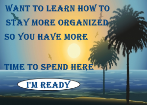

 This last 6 months have been a challenge for me – as most of you know I have had some health issues – so thought I would share with you one of the things that I have done to prepare for the unexpected.
 With all the bad weather that has been happening around the country, this is a must for anyone who wants to help keep their sites or advertising showing when the unexpected happens.



 While I am one that surfs many sites – today I was just thinking (scary thought
 Now I know most of you get that page what was the last site you seen? How many of you get it right and how many of you don’t. I know lot of people don’t like that mod but I really think that is great as it does help to wake you back up from just the click, click, click and not really paying attention
 Over the years, I have watched text ads and headliners to solo ads and I can tell you there is a trick to all this that I discovered. One when you are viewing ads – that text ad is competing with other things on that page and it has to jump out at you and say click me.
 So the next time you are adding your TEXT ADS – stop and think about what your a adding and ask yourself will someone click on it. Making your text ads from lessons I have learned is not that hard – just put a little thought into it the next time you are just going to add a site name – you will be surprised


